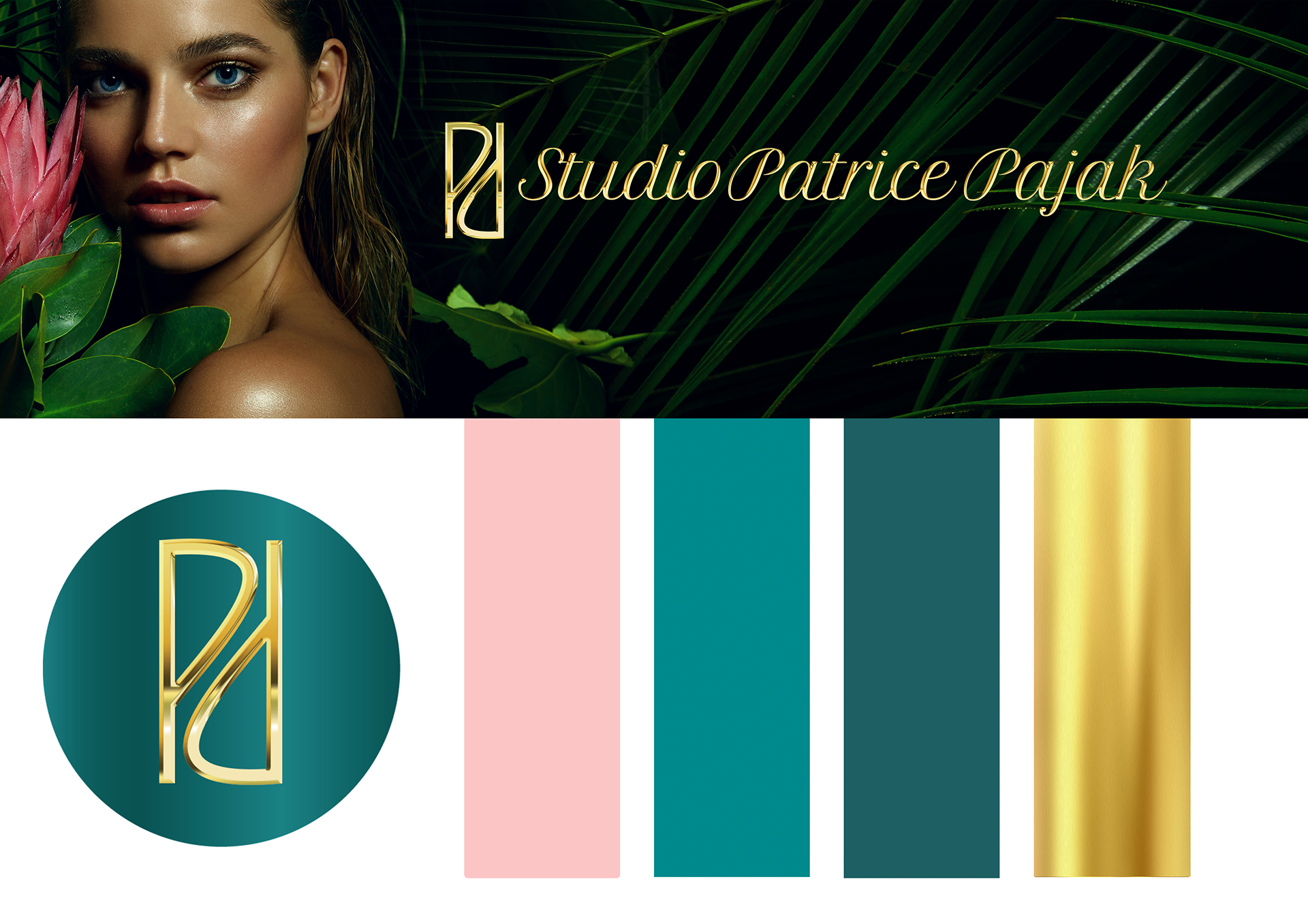
For the rebranding of Studio Patrice Pajak, I wanted the colors to capture the right vibe and energy for the salon. I chose turquoise because it’s all about calmness, serenity, and mental clarity—just like the ocean. It's perfect for creating a balanced and peaceful feel for customers when they walk in. To complement that, I added gold, which symbolizes achievement and success, as a nod to Patrice Pajak’s goals and dreams for her business. Together, these colors set the tone for a space that feels both relaxing and inspiring.
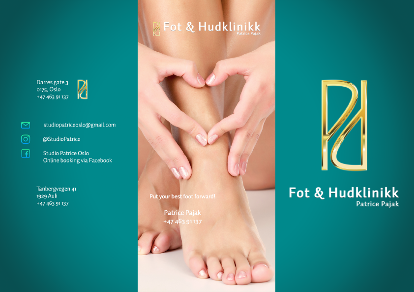
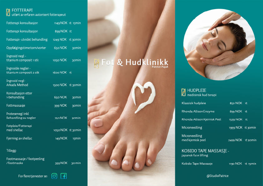
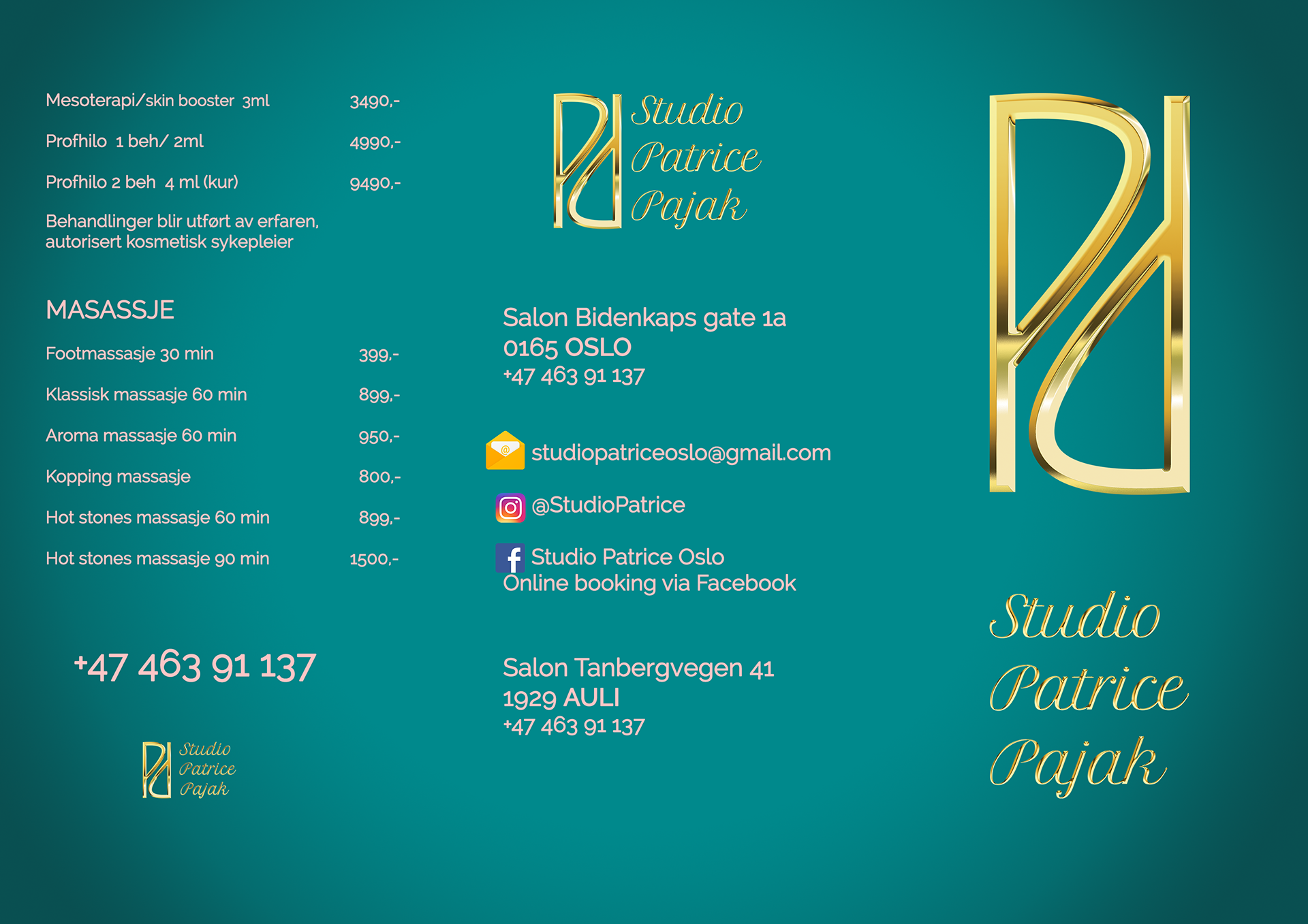
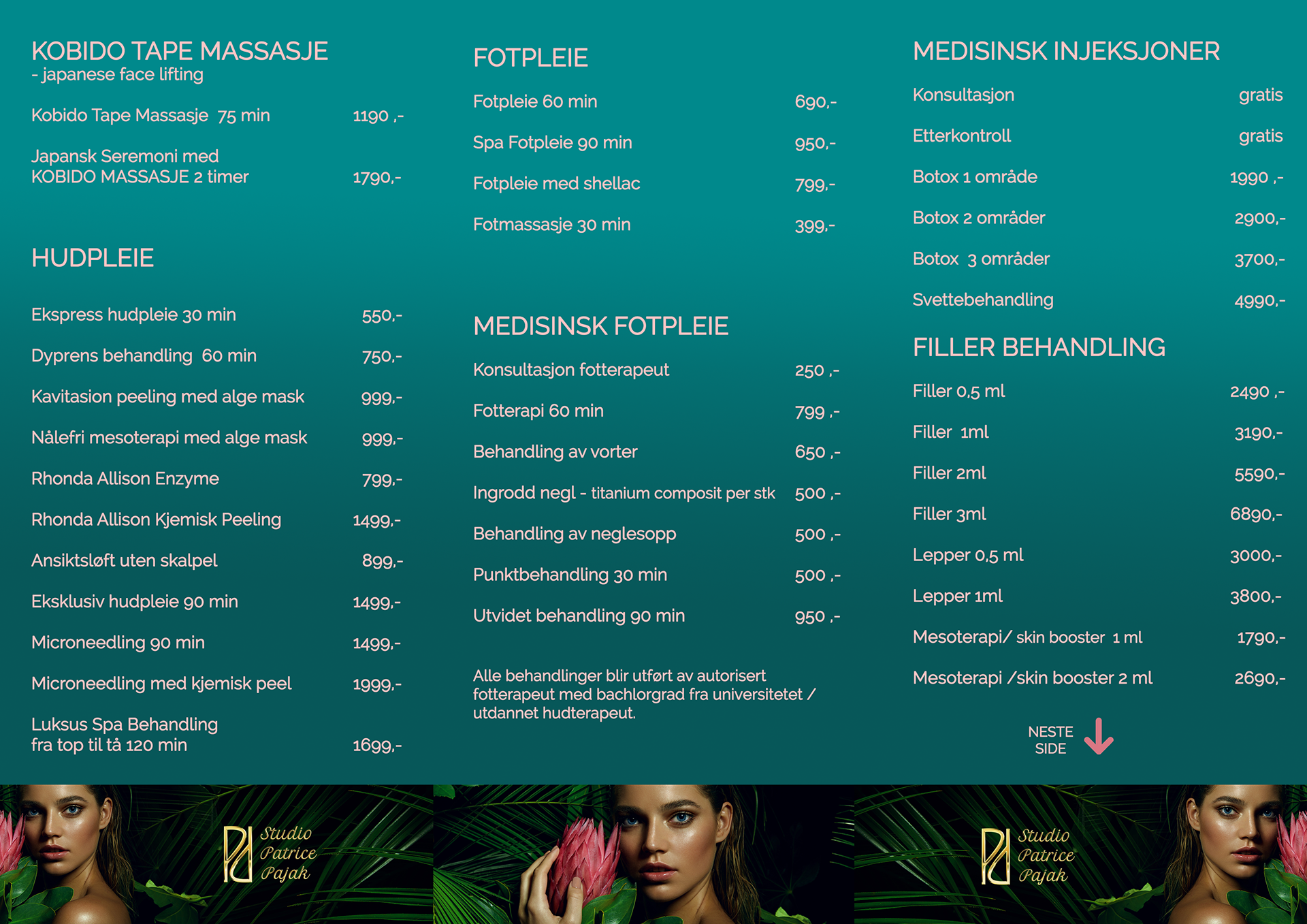
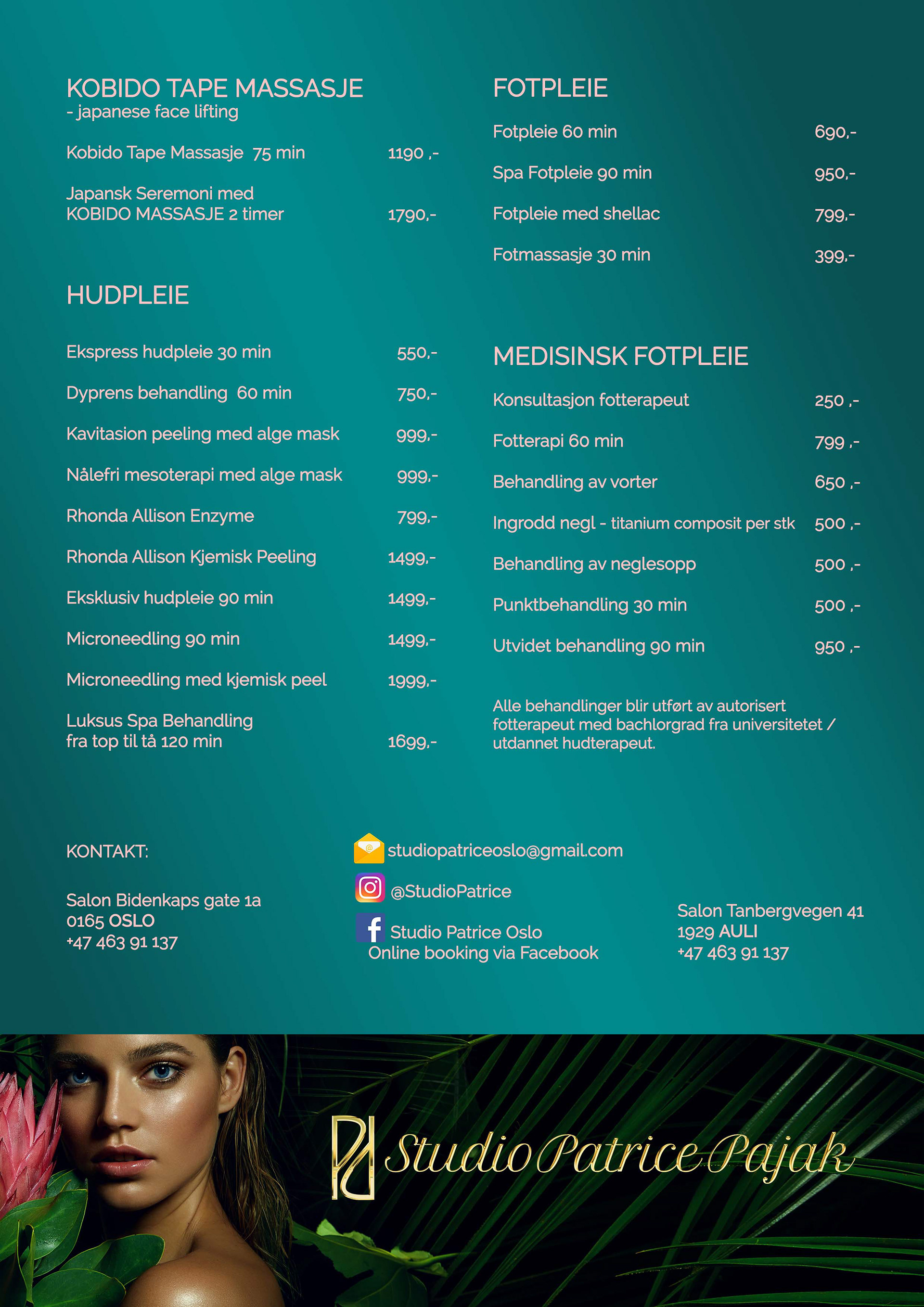
New brochure.
Graphic design by viem. (2023)
New logo design. (2023)

Logo design. (2021)


Brouchre & stand design. (2021)
Moodboard. (2021)